World House Editions @ International Fine Print Dealers Association Fair (2025)
- 14 hours ago
- 6 min read
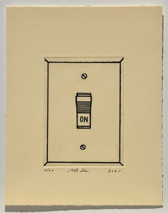
Mike Bidlo Not Lichtenstein (On, 1962) 2025 | Etching, Edition of 60. Signed, dated and numbered in pencil. Sheet: 10 3/4 x 8 1/2 inches (27.3 x 21.59 cm)
Bidlo continues his quest to reconceptualize the wheel. His new edition “Not Lichtenstein” takes as its origin mystery the 1962 print of a wall light switch titled “On”. This simple image is indicative of everyday choices in the domestic or business sphere, and with its chosen position, one of of positive inclinations. The light being on, so is the artist’s imagination. The ironic aspect of a satire about a satire plays right into the stylistic and symbolic aspects of the source material, and the society with which it is engaged. Bidlo’s work places the spectator somewhere farther down the rabbit hole of ironic distance from the social issues at hand. Are we still an “on” society? We are by all terms still adding art that’s minimal, concerned with functionality and Emersonian Self-Reliance, and is still looking back upon the past for emblems of truth. Bidlo reminds us that the paradigms are the purpose.

Saint Clair Cemin
Giant Blonde With Monument 2025 | Hand-printed woodcut, Edition of 20. Signed, dated and numbered in pencil. Sheet: 22 x 30 inches (56 x 76 cm)
This new print edition by Saint-Clair Cemin is a hybrid ideal, both a return to an art form important to Cemin’s early identity as an artist, representing provisional formats and disciplines—the one that left him with a desire to enter a new role as a sculptor; and a version of visualized two dimensional formats of the sculpture itself. The image is one of a larger primary figure paired with a smaller complementary one. Both have been birthed together, creating a symbiotic dynamic with spiritual overtones. Printmaking inspired and informed by a radically disparate medium such as sculpture brings with it a range of meaning specific to the affinities between them. The sculpture trades in physicality, and offers up a sensual appearance that
on paper is reduced to lyrical gestures more in common with drawing. As the eyes might caress the outward appearance and sensuous textures of a dimensional work, they similarly pass over this ambiguous image, that throws an aesthetic shadow over all future expectations. An oblique beauty inhabits the image, which compels while it likewise questions the meaning of form.

Donna Dennis
Soundings 2025 | Copperplate photogravure with Kozo chine collé and burnishing. Edition of 36. Signed, dated and numbered in pencil. Sheet: 22 ¼ x 25 ½ inches (56.51 x 64.77 cm)
It may be a hard truth to admit, but we are all a where as well as a who, or whom. When we alter this backdrop, our mirroring of certain conditions is revealed as a mask by which we attempt to separate ourselves from those aspects of ourselves that we fear. There is comfort in the consumption of ideas. We naturally expand into new parameters when circumstances change. Donna Dennis, whose primary work of past decades has been installation sculpture resembling industrial and domestic structures with telling character, recently found herself moved out of New York and into small town life upstate, where the quality of encounter is decidedly different. Her creative process required a methodical reset. Despite having had a consistent subject for decades, she found it less pertinent. “Soundings” is the result— consistently introspective, yet at the same time, divergently topical. The work is actually a photogravure print realized in collaboration with a master printer from Bard College named Lothar Osterburg. The image itself possesses a haunting aspect, comprised of only three elements: two faces of what seems the same country house, a two story Victorian with a severely arched roof, one side of the end of the house, with its “face” turned toward the viewer, while the other end of the house, its face skewed as if tilting in a gale, making the windows, its seeming eyes, gaze back in doubt. Perhaps it fears that it, or a part of the whole house, will become lost in the other pictorial elements, a copse of bare tall trees, and the enveloping night, Illuminated by random stars and one large moon, whose concentric rings of light, itself second generation illumination from a now distant sun, carry with them their own shadow, their own augury of the unknown. Soundings is a stir of echoes in a land of the lost, dreaming up a new future.
Nancy Grossman
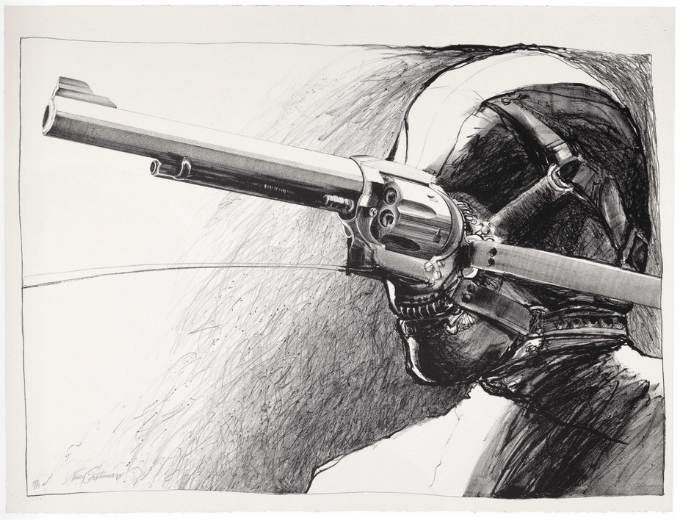
The Road to Life 1975 | Lithograph printed on white Hahnemule Copperplate paper. Edition of 175. Signed and numbered on pencil. Sheet: 19 ⅝ by 25 ¾ inches (49.84 x 65.41 cm)
This suite of early prints by Nancy Grossman augurs well for her contemporary understanding. Tracing her unique vision back to its roots, each of these prints identifies key psychological elements that predates the “heads” series for which she’s best known. Acoridng to Virginia M. Mecklenberg, author of Modern American Realism: The Sara Roby Foundation Collection, "Grossman’s […] distinctly individual understanding of the psychological reality of contemporary life is concerned with people as victims, Grossman […] created figures whose contorted postures and featureless faces convey an unidentifiable sense of panic.” (Smithsonian Institution Press, 1987). Given this qualification, the prints add a valuable layer to our view of her artistic development, adding both a creative genre and its accompanying forms which allow us to peer through the keyhole to a door thought forever closed, to view iconic images that embody her then-burgeoning sociopolitical identity. Each one carries with it a sense of drama: “Andrus” (1965) is a symbol of manly virility, performing a gymnastic exercise that ends up with him portrayed as standing upon his head. Yet the form also makes one think of a Tarot card, The Hanged Man, which is considered to be a symbol of sacrifice, surrender, and letting go of attachments. It can also symbolize a time of transition or transformation. The card encourages people to consider their lives from a different perspective. The symbolic character of the image is obscured by its narrative quality and visceral expression; “Communion” (1962) does not present a single figure, but a riot of forms entwined. It’s nearly impossible to tell who is whom. The pure physicality of the surface detail is the main overall symbol. The bodies writhe, they flow into a sea of sensuousness. They have a podlike or branchlike character, with a woman’s head at the center and what seems to be the body of an infant below her; a large muscular mass above her, which is perhaps a man. This communion is a meeting of symbolic forms showing an elemental ‘family of man’ so to speak, with the woman at the center. “In The Room” (1961) presents a macabre scene, in which a group of seemingly naked, possible zombie bodies are tied together and stand closely together at the threshold of a darkened room. Are these souls waiting to cross over into an unknown future? The crush of their bodies implies a sense of crisis, a loss of control, also implied by their nakedness. “The Road to Life” (1975) presents a single head in side relief, with its face obscured by a large, long barreled gun attached to its face. The implication that the road to life is through the constant overpowering of others with the threat of imminent death is perversely brutal, and connotes a dark heart at work. These and other still-extant works by Grossman exemplify her potent reputation within contemporary art.

Nancy Haynes
Untitled 5.95-9 1995
Monotype printed on handmade Richard Tullis paper, to the edges. Signed with the initials and dated in pencil in the lower right; also inscribed "NH RT 5.95-9" in pencil on the reverse. Sheet: 10 x 11 1/2 inches (25.4 x 29.21 cm)
The purity of minimalism, despite its considered appeal, often offers less context than necessary for an artwork to appeal beyond certain limited justifications. The art of Nancy Haynes takes its place in the aesthetic continuum as a model for the opportunity for transience. Her known painted works are recognized for establishing dimensions of illumination within very slight color grades, providing viewers with an alternative to the standard flat monochrome that’s become the signature impression of minimalists everywhere. Haynes’ work lays claim to an expressiveness lacking in her peers. Similarly, within the very significant prints which Haynes has produced is the monotype “Untitled 5.95-9” (1995), part of a series which the artist calls her ‘deconstructed grids’ — it is in its own way, a statement on the provisional nature of minimalism itself as emerging out of the analytical aspects of early Modernism. They are a critique on the unstated “rules” of post modern art. The ubiquity of the imagery, culled in such a manner, puts the relationship with the viewer into a commonplace context that likewise deconstructs the categorical assumptions one makes in aesthetically considering works affiliated with Minimalism. The work has a playful and introspective character, relying on chance impressions that seem to have originated in the lattice of a subway airflow grille. By presenting a grid that is deconstructed, literally losing its authority along with its rigidity, Haynes shows us that reductive art has a way to go, and that there are still new experiences to be had.


Comments